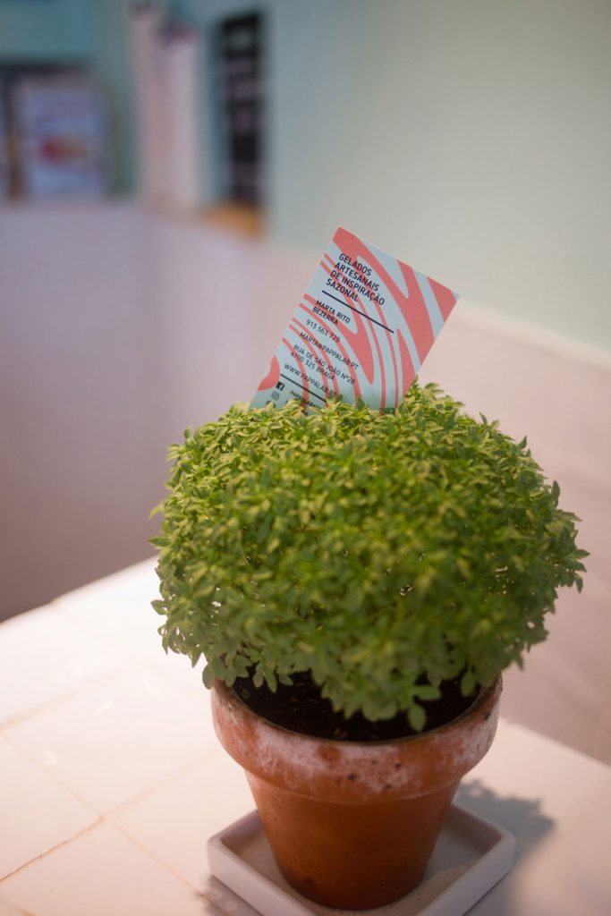
YEAR: 2018 CLIENT: PAPPALAB CORE: Ice-cream shop RANGE: Logo, Slogan, Pattern, Business Card, Ice Cream Cup, Bag, Take Away Package, Indoor Display Menu, Outdoor Information Panel, Awning, Storefront Sign, Interior Graphic Applications. CONCEPT: Seasonally inspired artisanal ice-creams Pappa Lab starts from a “paternalistic” Italian expression, and immediately gives away the origin of the recipes. A lab is nothing but a space for experimentation and innovation. The mixture of flavours, ingredients, textures and colours present in the artisanal production of ice-creams is transformed into a solution concept. It ensures a distinct and affirmative personality that attributes value to the product, and frame it in the urban-chic market. This idea is reflected in the original design, and in a simplified and geometrized gesture. When choosing the colours, a balance was sought between the fresh and the sweet, and was achieved through the shapes that support the pattern. PHOTOGRAPHER: Daniel Camacho